
Dimensions of the Faculty Logo.
The width of the Identifier makes a ratio of 2:1. Which means that the word ‘Applied’ fits into two rectangles and ‘Sciences and Arts’ fit into one rectangle.

The standard colors used are black and white. A range of secondary colors can be used in the designs of the identity.

Grid Structure: the Base of all the designs and lay outing text and images for the Faculty.

Four different lines with angles of 145, 35, 125 and 55 create one square of the grid. As displayed above how each line is displayed with its angle and then all lines are overlap to create the final image of one square for the grid.


Faculty's Latin and Arabic Typeface: 29LT Kaff.

Type Point System to Baseline Grid:
Four (Blue) of the H can equal the height of two large H (Blue) as six (Red) H can fit into the three H (Red) etc. This means that the smaller letterform size of the H is always double the bigger letterform size.


The grid can be complex or subtracted, the shown example is two grids creating different shapes; one of the shapes is too complex as the grid includes more sloping lines which creates a chance for developing the shape and creating endless possibilities.


Brand Manual Layout.


End of Year Exhibition: 10th Semester FASA.
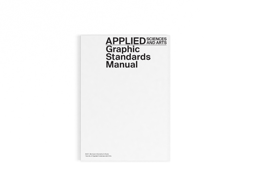
Brand Manual display.
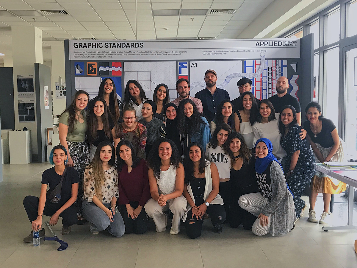
Designers behind the Faculty Brand Manual.

Designers behind the whole project.


